
When people think about gambling or gaming, they usually think about luck, strategy, or probability.
But one of the most powerful influences is much smaller.
Buttons.
Spin. Bet. Deal. Cash out. These simple shapes quietly guide what players do, how fast they act, and even how long they stay.
Most players never notice them. But in reality, button size and placement are based on deep research in human-computer interaction and behavioral psychology.
Nothing is random.
Every button is designed to guide attention, reduce thinking time, and encourage action.
Let us break this down in a clear and practical way.
Why Bigger Buttons Lead to Faster Actions
Large buttons are not just easier to see. They change how people behave.
Research in user interface design shows that larger touch targets can improve interaction speed by up to 30 to 40 percent, especially on mobile devices.
This idea is strongly connected to a principle called Fitts’s Law.
Fitts’s Law explains something simple:
The bigger and closer a target is, the faster a person can reach it.
That is why:
- Spin buttons are large
- Bet buttons are bold
- Action buttons stand out
Smaller buttons are used for:
- Settings
- Help menus
- Secondary options
Example
Imagine two slot interfaces:
| Design | Player Behavior |
|---|---|
| Large spin button in center | Faster, repeated spins |
| Small spin button in corner | Slower interaction, more thinking |
The difference is not just visual. It directly changes player actions.
Large buttons feel easier and safer to press, which reduces hesitation.
The Psychology Behind “Easy to Press”
There is also an emotional effect.
Big buttons:
- Feel safer
- Reduce fear of mistakes
- Encourage quick decisions
Small buttons:
- Require more focus
- Create hesitation
- Increase thinking time
A UX researcher once summarized it like this:
“If a button feels easy to press, people press it more often. Effort changes behavior.”
This is why casino apps often design the main action button as the most comfortable choice on the screen.
How Placement Guides Player Behavior Without Words
Size matters, but placement is just as powerful.
Designers carefully study how people naturally hold devices and move their fingers.
On smartphones, most users interact using their thumb. This creates something called the thumb zone.
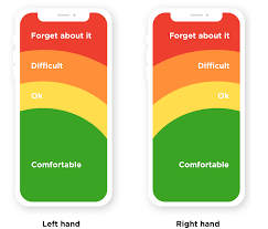
- Green area → easy to reach
- Yellow area → moderate effort
- Red area → difficult to reach
Important buttons are placed in the easy-to-reach zones.
That is why:
- Spin buttons are often at the bottom center or right
- Cash out buttons are placed within quick reach
- Less important options are pushed to corners
This reduces effort and increases speed.
Real Example from Casino Games
Look at most modern slot games:
- Spin button → bottom right
- Bet adjustment → near the spin button
- Settings → top corner
This layout is not artistic. It is behavioral design.
It ensures:
- Fast interaction
- Minimal hand movement
- Continuous play rhythm
Spacing and Accidental Click Prevention
Spacing between buttons also matters more than people realize.
If buttons are too close:
- Players make mistakes
- Frustration increases
- Trust decreases
Good spacing:
- Improves accuracy
- Builds confidence
- Makes actions feel smooth
Studies in mobile UX show that increasing spacing between buttons can reduce accidental taps by over 20 percent.

Clean spacing makes decisions feel easier and more controlled.
How Buttons Influence Decisions (Not Just Actions)
Here is where things get deeper.
Buttons do not just control how players act. They influence what players decide.
Example
- A large, bright Bet button feels normal and safe
- A small, dull Bet button feels less important
Even though both do the same thing, the perception changes.
This connects to another psychological principle called choice architecture, where design influences decisions without forcing them.
Real Player Comments
Players often notice the effect of design after reflecting on their experience.
Here are some real observations shared in gaming forums:
“The spin button is so big and easy, you just keep tapping without thinking.”
“Everything feels smooth, like the game is guiding your hand.”
“When I switched to a different app with smaller buttons, I actually slowed down a lot.”
These comments highlight a key truth.
Design changes behavior even when players are not aware of it.
The Role of Rhythm and Habit
When buttons are:
- Large
- Easy to reach
- Always in the same place
Players develop a rhythm.
Press → wait → press again.
This repeated cycle creates habit-based interaction.
Research shows that consistent interface design can increase repeated actions by over 25 percent, simply by reducing friction.
Once a rhythm starts, players often continue without consciously thinking about each step.
Why Consistency Matters
Imagine if the spin button changed position every few minutes.
What would happen?
- The player would slow down
- Attention would increase
- The flow would break
That is why games keep button placement consistent.
Consistency creates:
- Comfort
- Familiarity
- Automatic behavior
It is similar to muscle memory.
Final Thought: A Small Detail with Big Impact
At first glance, buttons seem like a minor part of a game.
But in reality, they are one of the most powerful tools in design.
They influence:
- Speed of action
- Decision making
- Player comfort
- Session length
Every detail matters:
- Size controls ease
- Placement controls reach
- Spacing controls accuracy
- Consistency controls habit
Next time you open a game or casino app, take a moment to observe.
Look at where the main button is.
Notice how easily your finger moves toward it.
Notice how quickly you act.
You may realize something important.
The button is not just there for you to press.
It is quietly guiding you the entire time.